A buyer account that keeps saved homes, price updates, tours, and agent communication in one place.
Housweet is a buyer account system for people actively searching for a home. Instead of a search engine, it is a persistent workspace: a place buyers return to track the homes they care about, see what has changed, schedule tours, and communicate with their agent without switching to email or text.
Buyers have no account. They have browser tabs.
Every major real estate product is built around the search moment. Browsing is fast, polished, and well-funded. What happens after a buyer saves a home is not. There is no persistent workspace, no update feed, no connection to the agent, and no record of tours already taken.
Buyers manage their search across Zillow saved homes, texts with their agent, calendar invites for tours, and email threads for follow-up. None of those surfaces know about each other. Every re-engagement starts from scratch.
Discovery gets the investment. Everything after is left to the buyer to manage alone.
Four decisions that shaped the buyer account.
Each decision moved the design away from search and toward persistence. The buyer account becomes useful only if it holds context across time, not just at the moment of search.
Early designs treated saved homes like a bookmark list: a read-only collection the buyer could review but not act from. That framing makes the account passive. Buyers need to move homes between consideration states, add notes, flag urgency, and initiate tours. Reframing the saved homes view as a working list rather than a read list changed the layout, the information density, and what actions were surfaced at each card level.
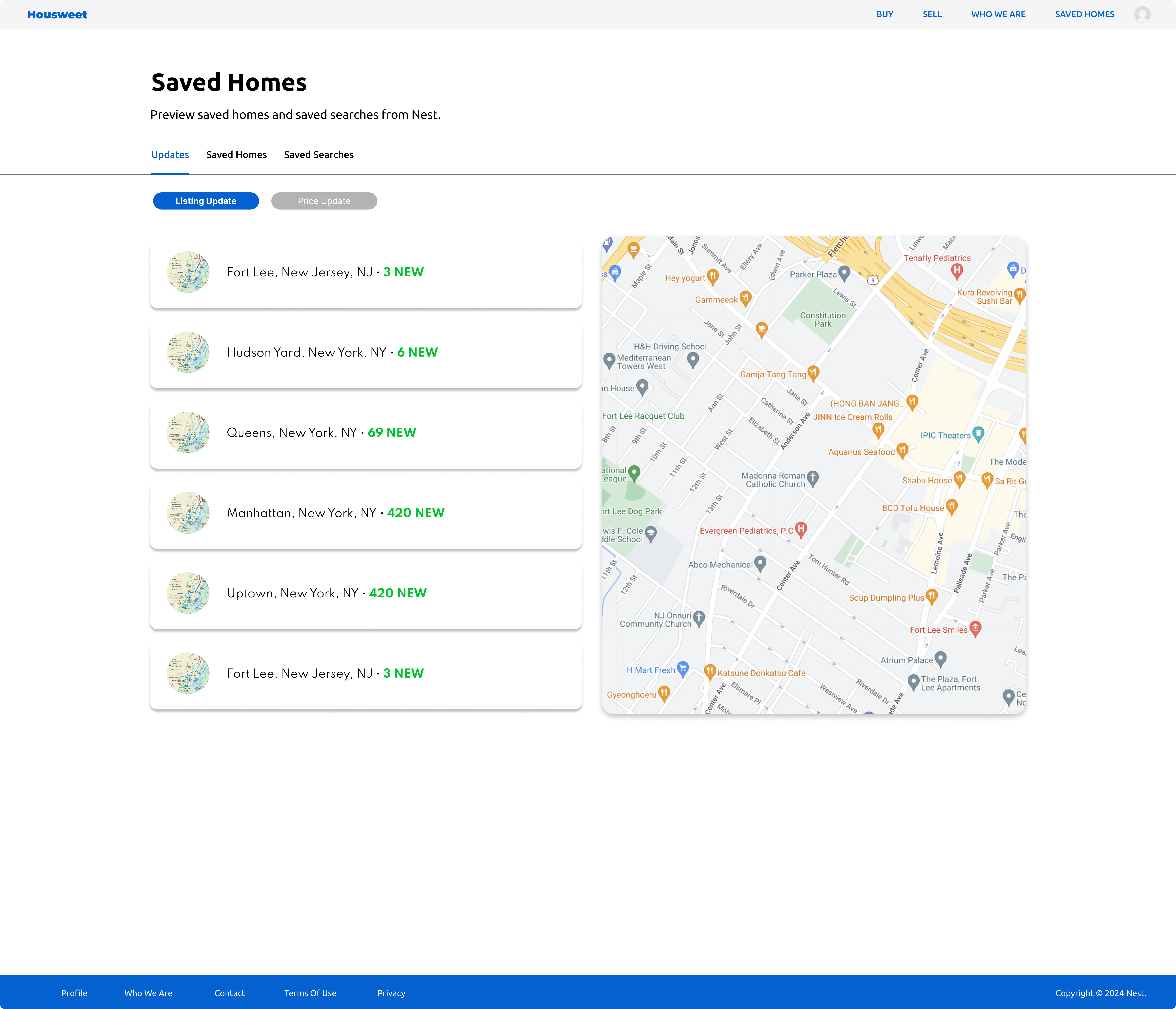
Notification badges require a click to see what changed and another click to see the context. Buyers checking in on five saved homes during a lunch break do not want to drill into each property individually. A unified updates feed surfaces all recent changes across the saved list in one scannable surface. Price dropped, status changed, new photos added: the feed holds all of it in one view, with enough context to act on or dismiss without opening the listing.
Scheduling tools treat tours as future events. Once a tour happens, it disappears from the view. Buyers who have toured eight homes in two months cannot recall the details of the third one without searching through photos or text messages. Tour history needed to persist as a navigable record linked to the saved home, with status, notes, and date visible without re-opening the listing. This shifted the tour section from a scheduling widget into part of the account record.
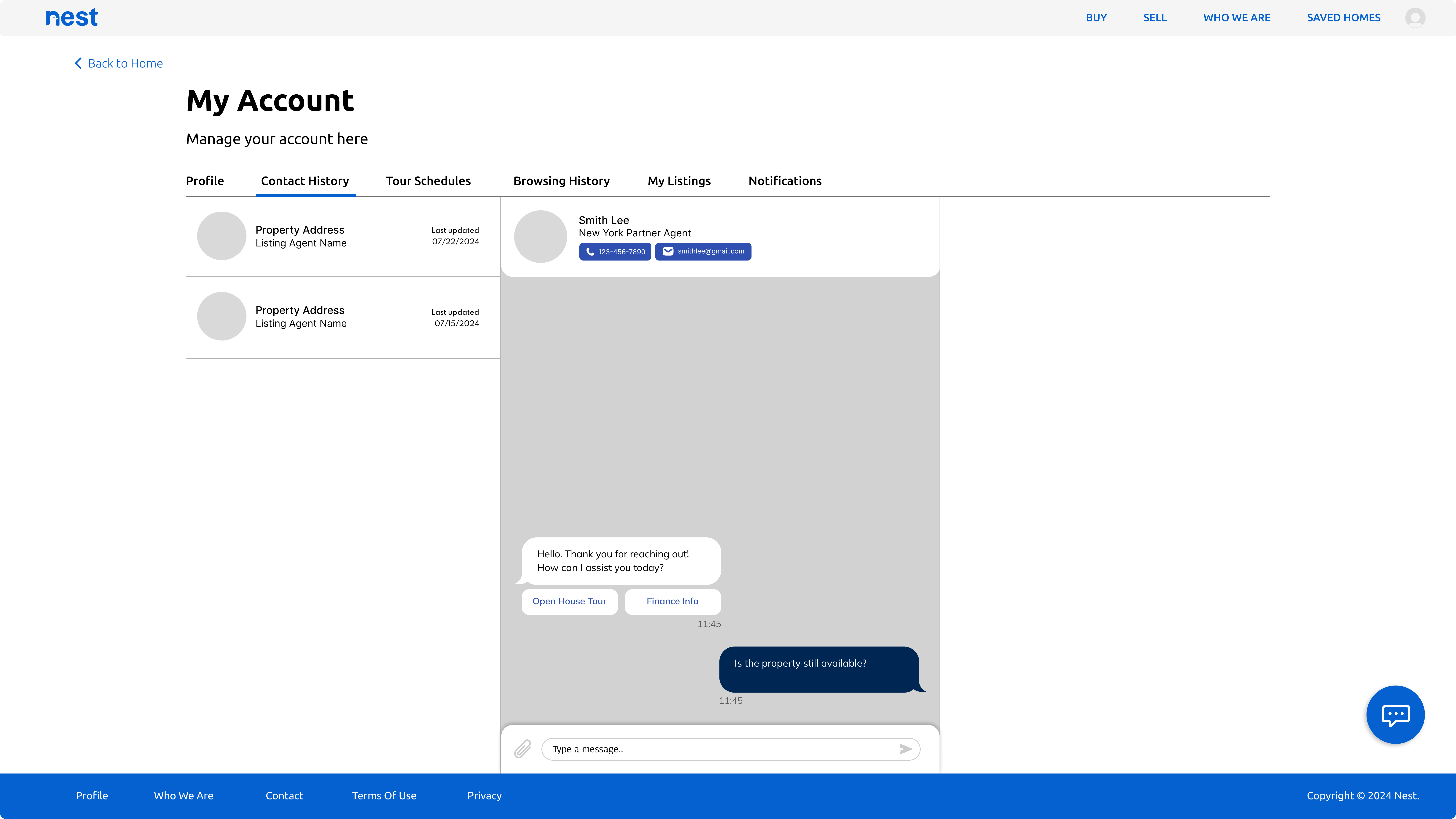
Buyers who communicate with an agent over weeks end up with a long, undifferentiated message thread. When they want to follow up about a specific property, they have to scroll. Linking contact history to individual saved homes means every message, question, and reply is visible from the property record rather than buried in a general inbox. The design decision was to build communication into the account structure rather than adding a messaging tab alongside it.
Trustworthy, familiar, and built for repeat visits.
Home buying is high stakes and emotionally loaded. The interface needed to feel reliable without being sterile: closer to a banking app than a property discovery feed. Neutral backgrounds, a constrained type system, and a single brand blue for primary actions and interactive states keep the focus on the listings rather than the interface.
From saving a home to scheduling a tour.
The buyer dashboard surfaces saved homes alongside a map view of monitored areas. New listings, status changes, and price updates appear in the feed without requiring a new search. The account becomes useful before the buyer opens a browser tab.
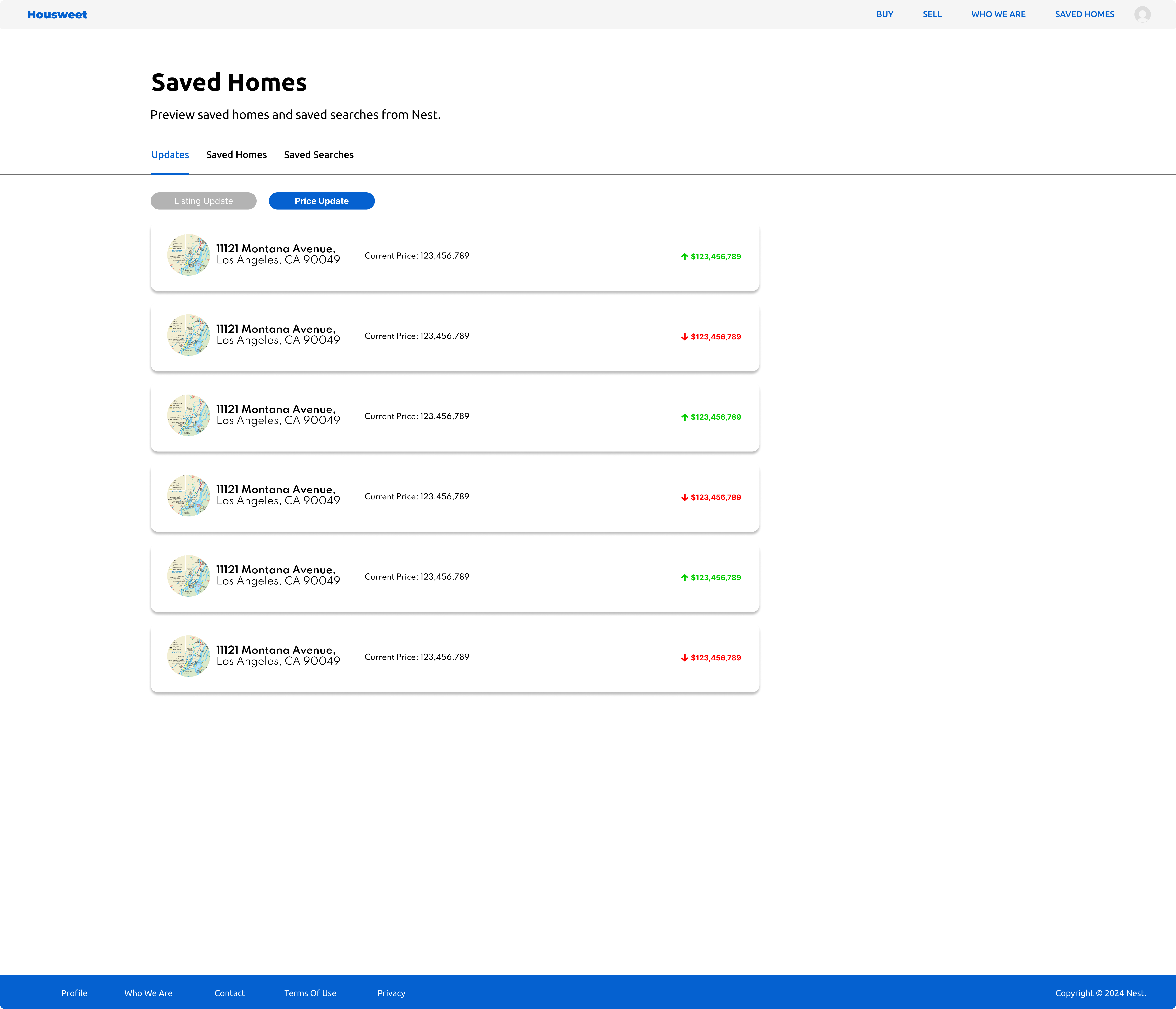
The price updates view highlights changes across all saved homes in one place. Price direction, current ask, and comparison to the previous value are all visible without opening individual listings. Buyers can scan five updates in thirty seconds and act on what matters.
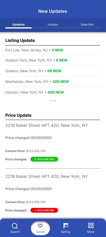
The mobile updates screen condenses saved-home activity into a feed sized for a few seconds of attention. New updates are grouped by type and recency so the most relevant changes appear at the top. Buyers can check in without launching a full search session.
The account view connects listings, agent details, and conversation history so buyers can see what was discussed about a specific home without scrolling through a general inbox. Every question, follow-up, and reply is visible from the property record it belongs to.
Completed tours persist as a navigable history rather than disappearing from a calendar. Buyers can compare homes they toured weeks apart without relying on memory or scrolling through photos. Status, date, notes, and agent are all accessible from the tour record.

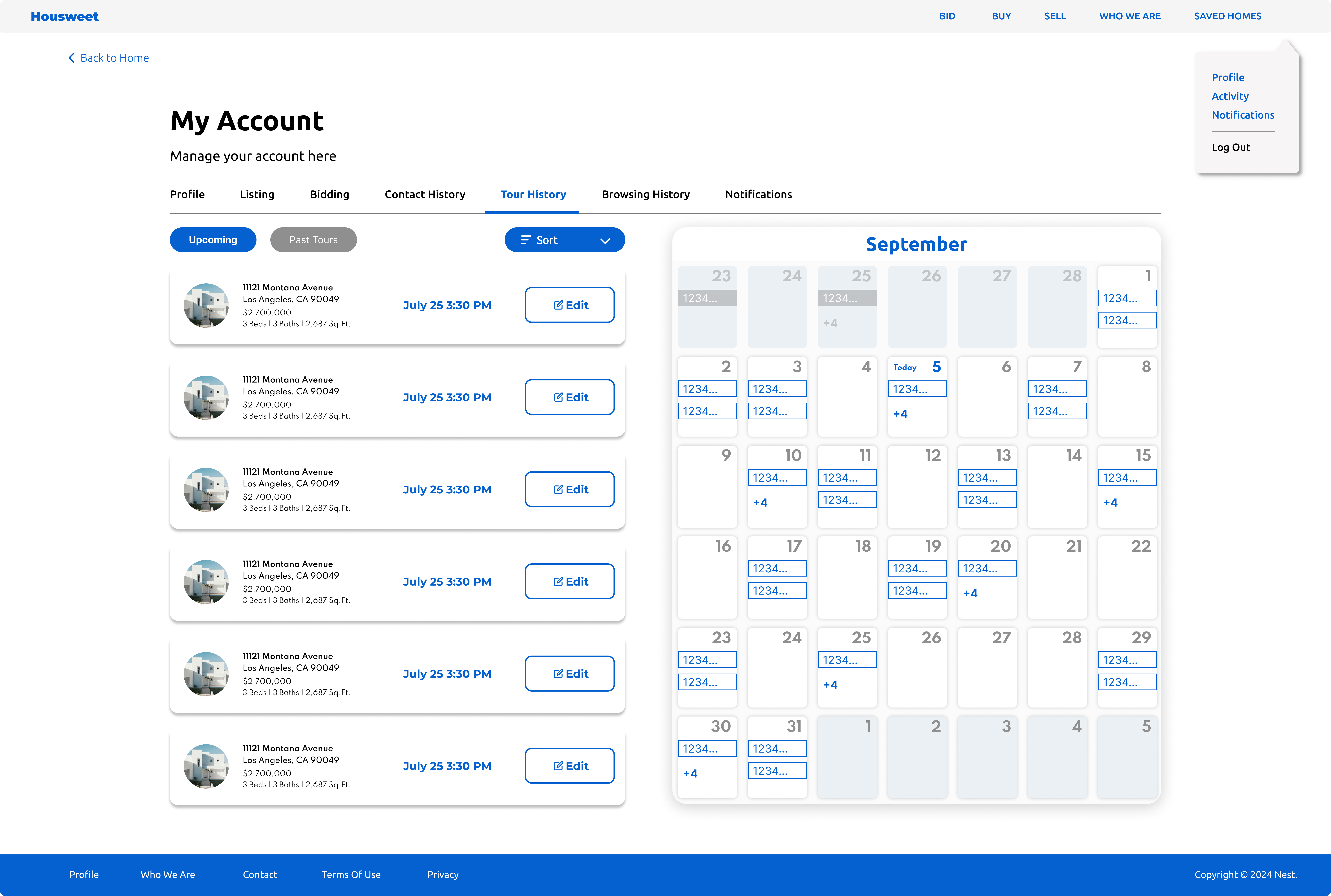
Upcoming tours appear as editable cards alongside a calendar view. Buyers can request, confirm, or reschedule tours without leaving the account. The calendar makes the schedule visible as a whole so buyers can manage multiple tour requests across different days without losing track of what is already booked.
AI as a first pass. People reveal the rest.
AI reviewed structure, hierarchy, and edge-case coverage across the saved homes feed, updates view, tour flows, and contact history. Human feedback surfaced where the account felt unfamiliar to users who had only used search-first real estate products.
- Reviewed information hierarchy across the saved homes feed, update cards, and tour sections
- Checked empty and loading states for all account views including first-time buyer onboarding
- Evaluated whether update card content was scannable at mobile screen sizes
- Flagged ambiguity between saved search alerts and saved listing updates as a navigation clarity issue
- Confirmed tour card actions were distinguishable from listing actions at a glance
- Buyers new to a persistent account model initially expected a search bar to be the primary entry point
- The updates feed required a brief orientation before buyers understood it was tied to their saved list
- Tour history needed a label distinguishing upcoming tours from past tours before users read it correctly
- Contact history linked to properties felt immediately useful once buyers understood the organization
- Mobile update cards needed tighter visual grouping to feel like a feed rather than a list of separate notifications
The mental shift from search to account. AI validated structure and hierarchy. People showed that the concept of a buyer account feels foreign when every real estate product the user has encountered is search-first. The account model only clicked once users understood they were meant to return to it across days and weeks, not use it as a search result page. That framing needed to be in the product, not assumed from the interface.
Designed, not shipped. A buyer-first account model ready to test.
Housweet is a portfolio concept, not a launched product. The outcome is a buyer account system that demonstrates what the post-discovery phase of a home search could look like if it were treated as a design problem rather than an afterthought.
Mapped where existing products leave buyers without a persistent workspace after the search moment, and specified what a buyer account must hold across a search that lasts months rather than days.
The saved homes feed, update cards, tour history, and contact log form a coherent account structure buyers can return to throughout a long search. The information architecture solves the fragmentation problem before the screens address it.
Listing update cards, tour cards, contact history rows, and calendar components were designed to function as a system. Each component holds the right information at the right density for the context it appears in.
The account model requires buyers to change a habit: checking a product instead of browsing a search engine. That is a product and onboarding problem as much as a design problem. Identifying it early is the outcome that matters most for any real-world build.
The onboarding model would come first.
The buyer account system works as a design artifact. The harder problem is behavioral: buyers have to understand that Housweet is a place to return to, not just a place to search. Every existing product trains buyers to start with search. The account model asks them to start with their saved list, and that is a habit that does not exist yet.
If I revisited this, I would focus the next pass on the first-use and return-visit experience. The first session needs to make the account feel instantly useful, which means it has to import or prompt for saved homes before showing an empty dashboard. Return visits need a reason to open the account on days when nothing has changed, otherwise the habit does not form. That problem sits between the product and the notification system, and it is harder to solve than any individual screen in the current design.